The Antlers - Hospice
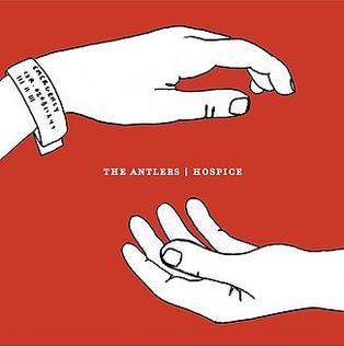
As Hospice is a concept album, telling the narrative of characters unrelated to the band in one cohesive story rather than a collection of songs as a normal album, it is logical that the album art reflects this. Thus, instead of featuring an image of the band or any references to a musician's lifestyle (eg instruments), it instead focuses on the eponymous story, demonstrating the chasmic relationship between the patient and the doctor through the use of hands. It is the art style which stands out most on this cover, which is hand drawn and almost cartoonishly simple when compared to other albums from this genre. However, the small font and large amounts of blank canvas reflects the minimalist/single textured music style, whilst the simple colour format is effective at distinguishing the album from others on the shelf.